Updated report graphs Apple’s dedication to supporting older iPhones vs. Android
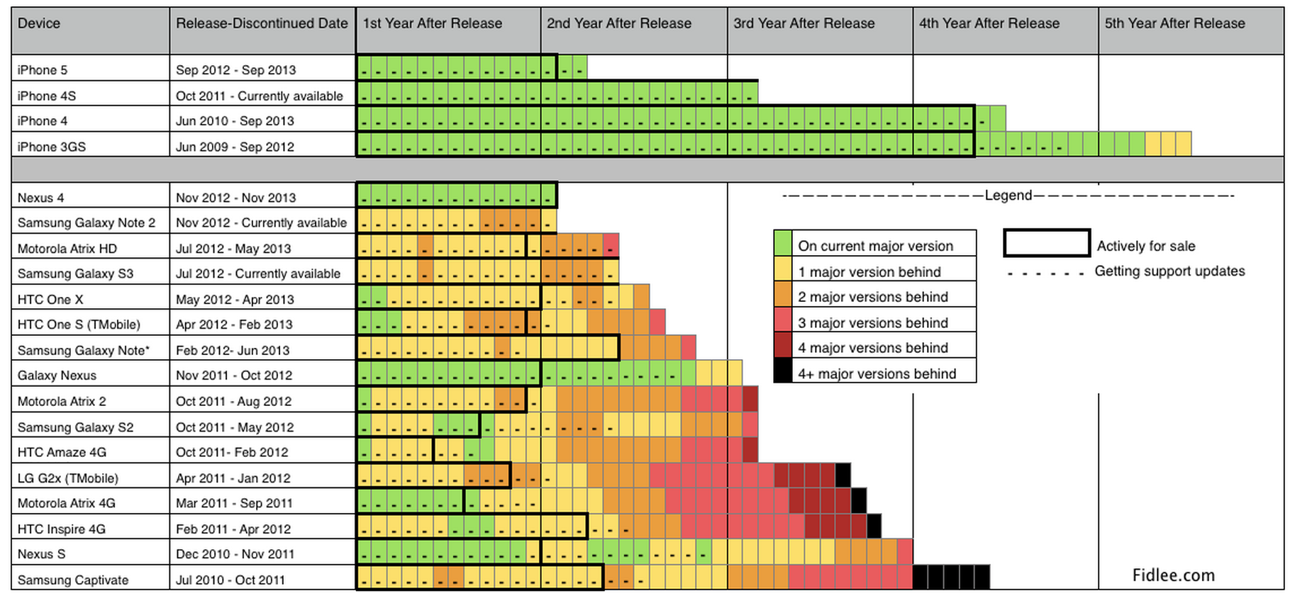
We hear a lot about adoption of iOS updates vs the fragmentation that Android users are forced to deal with, but just how far behind are the top Android devices compared to iPhone when it comes to getting support? To answer that question, Fidlee.com has updated a chart that it first put together a couple years back in order to see if Android has become any better in recent years. It hasn’t.
In the chart above we see that many once flagship Android devices— the Galaxy Note 2, Galaxy S3, LG G2 etc— have still not received the latest Android 4.4 KitKat update. Most of the devices on the list have been an upgrade or two behind since launch or not long after. In comparison, only the iPhone 3GS fives years after its release doesn’t support iOS 7. We also get a look at how much longer Apple devices generally stay available for sale and continue receiving support– nearly twice as long as Android in most cases.
Not only did Apple claim iOS 7 was “the fastest software upgrade in history” with more than 200 million devices installing the OS less than a week after launch, but analytics firms also noticed adoption was much higher than previous releases. Currently iOS 7 sits at about 77% of users, according to the latest data from Fiksu’s iOS Usage Monitor. While the chart above is only for devices released last year, things aren’t much better for newer Android devices. In comparison to iOS 7 adoption, Google reports that its latest release, Android 4.4 KitKat, is at just 1.1% weeks into launch. The previous release, Android 4.3, is at just 4.2%, while the majority of users remain on Android 4.1 Jelly Bean first released in July 2012.
A couple more charts below from Fidlee showing just how bad things are on Android:
Expand
Expanding
Close