
User experience

See All Stories

Opinion: Apple Watch + Music show intuitive software should be top priority for Apple’s new VP of UI Design

Site default logo image

applemusic1x

Like many other people, I signed up for Apple Music yesterday because it was intriguing and free. Having skipped earlier subscription music services, I didn’t have Spotify playlists to worry about losing or importing, and I hadn’t experienced truly unlimited access to a giant music selection before. Apple Music’s sign-up process turned out to be great: attractive, simple, and just personal enough to learn my tastes without feeling creepy. It’s also likely to win long-term customers: sign up your family, and after 3 months, someone’s going to insist on keeping Apple Music (or just forget to cancel it).

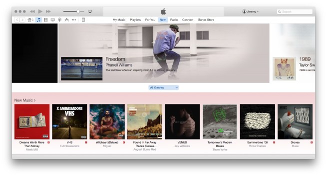
But once the sign-up process is over, Apple Music repeats a mistake that Apple made earlier this year with the Apple Watch: throwing users into the deep end of a big new pool without adequate guidance. Despite all the talk of importantly human-curated content, Apple Music is oddly and robotically silent when it should be actively guiding new customers through a brand new service. In prior years, Apple held back products until they were polished enough that anyone could use them immediately. These days, Apple releases major products with enough rough software edges that customers and reviewers are (rightfully) complaining about learning curves and unintuitive interfaces.

As of today, Apple has a new VP of User Interface Design, Alan Dye, who is taking over software-side responsibilities from Apple’s vaunted design chief Jony Ive. In light of the Apple Watch and Apple Music launches, both of which were criticized for unnecessarily complex user interfaces, I’d respectfully suggest to Mr. Dye that fixing this problem should be a top priority…


Expand
Expanding
Close

Site default logo image

The secret behind Apple’s design excellence is a simple one, says former senior designer & UX specialist

iphone

The secret behind Apple’s design excellence is a simple one, says former senior designer and user experience specialist Mark Kawano in an interview with Fast Company: it’s not just something left to the designers.

It’s actually the engineering culture, and the way the organization is structured to appreciate and support design. Everybody there is thinking about UX and design, not just the designers. And that’s what makes everything about the product so much better . . . much more than any individual designer or design team.

Kawano says that everyone on the team caring about design was how Apple was able to create its core products in the early days of the iPhone with a team of around 100 designers.

For the most part, Apple didn’t employ specialist designers. Every designer could hold their own in both creating icons and new interfaces, for instance. And thanks to the fact that Apple hires design-centric engineers, the relatively skeleton design team could rely on engineers to begin the build process on a new app interface, rather than having to initiate their own mock-up first.

He also revealed that many of the small, thoughtful touches for which Apple is famous were things that individual designers and engineers came up purely as interesting experiments and then tucked away for years. He gave the example of the password box in OS X shaking if you didn’t enter it correctly.

Say we need a good way to give feedback for a password, and we don’t want to throw up this ugly dialog–then it’s about grabbing these interaction or animation concepts that have just been kind of built for fun experiments and seeing if there’s anything there, and then applying the right ones.