My shiny new Mac arrived on Friday, so after a couple of days of fairly extensive use, it’s time to give my M1 Max 16-inch MacBook Pro first impressions.
I haven’t used it for anything too taxing as yet, so this piece covers what I think of the design, the screen – including that infamous notch – the heat management, and an early look at real-world battery life …
When it came to buying it, I did hesitate a little on the spec, before opting for an almost maxed-out model.
I’ve historically maxed-out my Macs on the basis of maximizing the useful life of the machine, before reliability concerns led me to re-second-guess that approach. If I were going to replace Macs every three years, that would make it tougher to justify the premium for a top-spec model, as you never recover the price difference on resale.
However, when it turned out that the M1 Max offered literally twice the performance of the M1 Pro, then I found it impossible to resist.
The reasoning for the rest you can read in my previous piece.
With just a few days of macOS Monterey before my new machine arrived, I didn’t bother to update my old one (I never do Mac betas!), so that may be the reason why the M1 Mac didn’t recognise the Intel one when connected via a Thunderbolt cable. But even with almost 3TB of data, the migration from a Time Machine backup wasn’t too bad: around seven hours from a 7200rpm spinning metal drive over USB3.
Ports
I’ve noted before that the new ports are pretty much irrelevant to me. My monitor is connected via a single USB-C cable, so I have no use for the HDMI port. I’m currently in a video-only phase on the photography side (using only my iPhone for still photos), and I shoot onto an external SSD, so have no need of the SD card slot either.
Aesthetically, the new ports do make the machine look a little less tidy, but I know others value the ports, so I can’t complain at that.
External design
The new design definitely gives the machine a much boxier look! As Jason Snell observed, it’s almost reminiscent of the Titanium PowerBook G4. It may just be the novelty factor of a new design after such a long time, or perhaps a nostalgia kick, but I really like it.
There are two specific design touches that stand out externally. The first is the polished black Apple logo on the lid, the second is the engraved MacBook Pro on the bottom. I’m a fan of both, the latter in particular reminding me of the famous Steve Jobs story about painting the back of the fence. Hardly anyone will ever see the engraving, but Apple took the trouble to do it anyway.
Keyboard
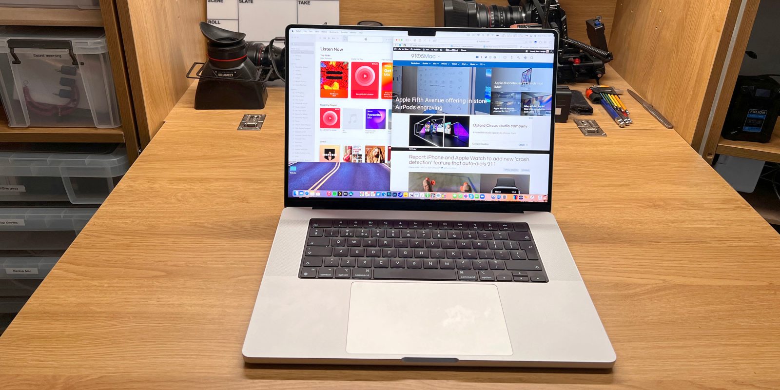
When you open the machine, two things jump out at you. The first, of course, is the thin-bezel screen, and That Notch. The second is the all-black keyboard.
I must say I am not at all a fan of the new keyboard design. I much prefer the previous design of black keys against the aluminum casing. The original design really made the keyboard look like an integral part of the Mac. The new design looks cheap, like Apple bought an off-the-shelf keyboard and just dumped it in there.
I didn’t think I’d miss the Touch Bar, but I do a little. I said before that the only things I ever used it for were volume and brightness sliders, but it did work beautifully for those functions. Going back to the step jumps of keys does feel like a backward step – so much so that I find myself using the Control Center sliders instead.
Finally, and this may be my imagination, but Touch ID seems faster. With the previous model, it felt like I had to touch my finger to it and pause a moment, while this one seems instant.
Screen
The headline feature of the redesign is, of course, the new screen. Thin bezels. The notch. Mini-LED backlighting. ProMotion.
Thinner bezels
The thinner bezels look fantastic. The thickness of the older MacBook Pro bezels had become frankly embarrassing when viewed alongside modern premium Windows laptops. This bezel size feels contemporary, and although the actual increase in screen size is rather modest, it does feel much more expansive.
I like as much screen real-estate as possible, which is the reason I loved the 17-inch MBP back in the day. That being the case, I use my MacBooks in More Space mode, to maximize resolution rather than PPI. With this model, however, the default resolution is a perfect 2:1 for the crispest text, and a colleague bet me I’d find it so perfect that I’d sacrifice the extra resolution for it. He was wrong! It does look amazing, but I find the full resolution still looks great, and for me is far more usable.
The notch
Of course, what everyone wants to know is how does the notch look in real-life use? With just two days’ use, already my answer is: What notch?
For me, the experience is exactly the same as the notch on my iPhone – I simply don’t notice it any more. It blends very well into the menubar, and I would far rather have a 1080p camera at the top of the screen in a notch than either a 720p one at the top or a 1080p one at the bottom. People can argue about whether another option could be possible (though the evidence they present is usually a Windows PC with a 720p camera, or a two-in-one device where the screen is actually a chunky tablet). But either way, my view is that it’s much ado about nothing.
Mini-LED backlighting
There seems to be a lot of confusion in the non-tech press, people describing it as a new display technology. It’s not: It’s the same high-quality IPS LCD screen Apple has long used. What’s different is the backlighting, with many more, much smaller, LEDs.
But … this does make a significant difference. The extra light, and the much improved controllability (lighting or not different screen zones), does make for dramatically improved contrast. Blacks are much blacker, and whites are much brighter. If you plan to turn the brightness up to maximum, I suggest you don a pair of sunglasses first – this thing is seriously bright! Next time it’s a sunny day, I’ll try it outside (bear in mind I live in the UK, so this will probably be next May).
Pro Motion
Apple messed up the Pro Motion feature by showing it in use in Safari during the keynote – when the release version of Safari doesn’t yet support it. Scrolling while browsing seems to be the most compelling benefit, so to not see it there really is inexplicable.
When Apple brought Pro Motion to the iPad, it didn’t seem a big deal until I went back to an iPad without it. It was a similar story here – at first.
When I saw it in system animations, like switching between desktops, I thought it was a nice feature, but no big deal. It was only when I compared it back-to-back to my old machine that it really stood out.
However, when I saw scrolling text with Pro Motion, it was immediately obvious just how good it is! It’s just sooo buttery smooth, that once you’ve seen it, you really want to keep it! Unfortunately, this is pretty much limited to Catalyst apps for now. I’m now very impatient for Apple to bring this to Safari!
Speakers
Apple touts the performance of MacBook Pro speakers with each new model, and I always roll my eyes a little. Yes, I think, the speakers are decent, but they are laptop speakers. They have for some time been on a par with a very middling portable Bluetooth speaker in both quality and volume, and that hasn’t changed.
Battery life
While Apple says that the maximum battery life is 21 hours for video, the number I always look for is ‘wireless web.’ That’s my most common use of the machine, so that’s the claim I want to test against.
Apple says this is up to 14 hours, with brightness set to 8 clicks. I always assumed Apple used an unrealistic brightness level, but when I checked, that was indeed the brightness I’d selected. (I do use 100% when watching video.)
It actually took 34 minutes for the battery level to change from 100% to 99%! That percentage may or may not be accurate, of course.
My initial use of the machine was atypical in a number of ways. Spotlight was indexing. I watched several hours of video in Plex, at full brightness. I was using Photoshop much more than usual. Third, I left it off power overnight, so the battery life also included whatever it consumed while sleeping.
In all of this, it was 9h 8m when I got the 10% warning. That suggests a little over ten hours’ total life.
That’s some way from Apple’s 14 hours claim, but I’d expect it to be better in more typical use – and, honestly, a genuine 10 hours of use is still very good in my book. On my Intel machine, I got 5-6 hours of real use, so this is at least doubling the battery life.
I’ll be testing this with more typical use, and will report back in a later piece.
Heat management
Apple promised that the machine runs much cooler than its Intel predecessor, and that fans wouldn’t be required in normal use. I can confirm both claims.
Even doing very ordinary tasks, my Intel MBP 16 would get a very hot base during extended use, as well as the section above the keyboard. Indeed, in summer I’d have to put a cooling mat under the machine if I were using it on my lap for an extended time.
With my M1 Max 16-inch MacBook Pro, I literally haven’t heard the fans come on once, and after more than ten hours of continuous usage on day two the base was just barely above skin temperature, and the section above the keyboard is completely cool. This is a massive difference.
Application memory error
A number of Mac users, me included, are seeing this error message, with some apps using more and more unified memory until they crash. It’s unclear at this moment whether the issue is specific to M1 Macs, but I’m just relieved it’s not a hardware issue.
Magic Keyboard with Touch ID
I was really impressed with the ease of setting up the Magic Keyboard with Touch ID – it’s basically fully automatic. Use a USB-C to Lightning cable to connect the keyboard (or trackpad or mouse) and it is instantly recognized and paired. You can immediately remove the cable. Touch ID is also automatically configured, making use of the existing fingerprint data stored on the Mac.
Apple’s ‘It just works’ claim isn’t always accurate, as we all know, but this is a great example of it Just Working.
M1 Max 16-inch MacBook Pro first impressions
So far, the only negatives I’ve come up with are:
- The black keyboard inset
- Slightly clunkier volume and brightness controls
- The app memory error
On the positive side:
- External design
- Thin screen bezels
- Mini-LED backlighting gives much better contrast
- Pro Motion, especially when scrolling text
- Battery-life (doesn’t meet Apple’s claims, but still very impressive)
- Runs beautifully cool in normal use, with zero fan use
Hopefully the app memory fault is very quickly fixed. Assuming that does prove to be the case, then my only complaints are very small ones indeed – while the positives add up to a really huge deal.
I said I wouldn’t be commenting on the performance, as my only demanding need is video editing and I don’t do that often enough to make meaningful comparisons. There will be plenty of those to come from others. But I can say that restarts are now super-quick!
Unless anything major crops up, I’ll write another piece once I have a few more things to say, likely in around a week.
If you’ve taken delivery of yours, please share your own first impressions in the comments. If you haven’t ordered one, has anything here changed your view? Again, please let us know.
FTC: We use income earning auto affiliate links. More.


Comments