9to5Mac is brought to you by CleanMyMac X, the all-in-one utility that can help keep your Macs clean, fast and protected in just a few clicks. Try it for free or upgrade to the full experience.
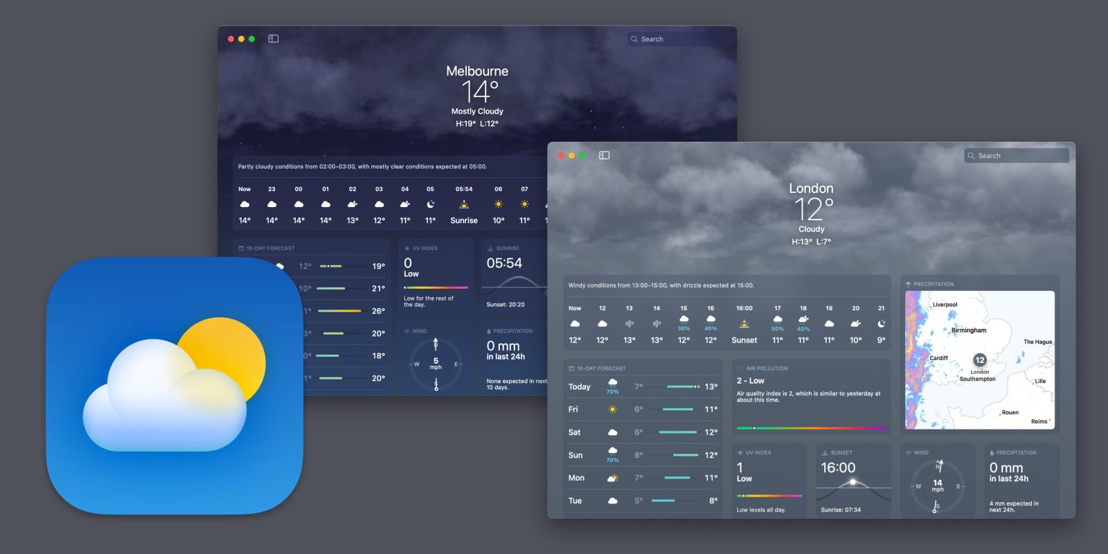
With Ventura, Apple launches a native Mac Weather app for the first time. It may have taken a while, but they’ve done a great job of it. Apple Weather is a modern Mac weather app with an elegant grid layout of info panels, eye-catching visual backgrounds, and richly detailed charts available to view when you dig in. Here’s everything you can do in Apple Weather for Mac.
The new Weather experience is now available across all Apple platforms — including iPad with iPadOS 16 — and based on in-house custom weather data sources.
This is all built on the foundations of Dark Sky, a service that Apple acquired in early 2020. There are still reasons for third-party weather apps to exist, but it seems like most users are going to be very satisfied with Apple Weather going forward. It is (surprisingly) full-featured …
Weather app design


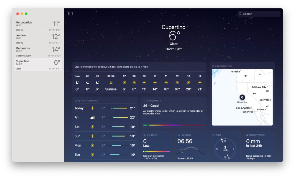
Weather on Mac uses a sidebar-detail layout. Your locations are available in the list on the left. Enter an address in the search bar to find locations and add them to the list. A dynamic ‘My Location’ list item enables quick access to weather for your current location, wherever you are.
Select a location to see its weather data in the main area of the app window. The header contains the current temperature, summary of conditions, and high and low temperature. And for visual flair, the page sits on a background that reflects the current weather, with dynamic animations like rolling clouds, flashes of thunder or falling snow.
Below the header is more data, laid out as a grid of panels. The grid is not rearrangeable or customizable, but is designed to put the most important data at a glance. In critical conditions, a special panel will be added at the top to warn of hurricanes, flood risks and other significant weather events.
Adjust Weather app layout

On the Mac app, you can adjust the layout of the app in a couple ways. Hide or show the sidebar, to focus in on one city. Press the icon in the top left of the main view to toggle sidebar visibility.
You can also optionally enlarge the map. When expanded, all the other grid tiles are shuttled into a single column, allowing the UI to focus on the map content. By default, the animating map shows the precipitation forecast for the next hour. Click on the map label to view to a 12-hour forecast instead. And with the floating filter button, switch the map from displaying precipitation to showing temperature or air quality instead.
By default, Weather defaults to the temperature metric used by your local region. You can override this and show temperature in your preferred unit of measure by changing the setting in the View menu (selecting either Celsius or Fahrenheit).
All the different weather data available in the Weather app
Each panel contains a visual graphic or chart about a different kind of weather data. Click on a panel to reveal a popover containing even more details, and switch between days. Here’s everything you can access:
Conditions Summary

The first panel contains temperature and weather conditions for the next 24 hours or so, delineated by hour. Each hour segment shows an icon for the current conditions and the corresponding temperature, so you can get a sense of the day’s weather at a glance.
Click on this panel to see temperature conditions visualized as a line chart. Hover the mouse over the chart to see specific data for a point in the chart. The popover view also includes a written forecast summary for the selected time.
10 Day Forecast

The next panel represents the ten day forecast, grouped by day. Temperature highs and lows are displayed, including a small bar chart that allows you to visually compare the expected temperatures over the forthcoming week. The summary icon for each day reflects conditions, and will include a chance of rain percentage, if appropriate. Click on a particular day to reveal a temperature forecast chart for that day.
Air Quality

This panel shows the Air Quality Index. This estimates how many particulates are in the air, on a scale from 0 to 500. A higher number means dirtier air which is worse for your health. Generally, a number below 50 is considered good. Typically, unhealthy levels start at around 150 mark. Click on the panel to see more context about the current reading, if you are unsure how to interpret it.
Note: Depending on the location, the scale may differ. In the US, this shows the Air Quality Index. But in the UK, for example, it uses a 1-10 scale of Air Pollution instead.
UV Index

UV Index describes the strength of the sun’s rays, and hence your exposure to ultraviolet radiation when outside. In addition to the current UV Index reading, this panel will also suggest what hours of the day it is recommended to use sun protection. As a general rule, sunscreen and shade is recommended at UV index levels 3 or higher.
Click on the UV Index panel for a detailed color-coded chart, and a reminder about what the scale means.
Sunrise/Sunset

The next panel will prominently show either Sunrise or Sunset times, depending on current time of day. This includes a visual graphic, depicting the sun’s progress through the sky.
Click on this panel to get more details, like time of first light, time of last light and the total number of hours of daily expected today. The popover panel also includes monthly averages, showing just how much the amount of daylight hours change over the course of a year.
Wind

The Wind panel shows windspeed, using a compass style design. The arrow points to the current direction of wind, with the mph speed displayed in the center. Windspeed is calculated as an average over a period of time. The Weather app can also show gust measurements, defined as the faster wind speeds experienced over short bursts of time. Click on the compass to see more fine-grained information, including a forecast chart spanning the next twelve hours.
Precipitation

As previously mentioned, you can view precipitation visually using the map. But there’s also another tile to see this instantaneous information numerically. Precipitation can include rain, sleet or snow — and is measured in millimeters, over 24 hours. Weather app tile shows precipitation over the last twenty fours, and forecast precipitation for the next twenty four hours. Click to see a hourly bar chart.
Feels Like

The headline measured temperature is not necessarily what your body experiences. Feels like estimates how hot or cold it actually feels to be outside at a particular time, accounting for factors like humidity and wind chill. In fact, the Weather app will tell you the reason why the feels like temperature is different. Click to see an hourly graph, and view data for different days, with highs and lows marked on the line chart.
Humidity

Humidity measures the amount of moisture in the air, as a percentage. This weather panel also includes the dew point estimate, which is the temperature at which dew droplets will begin to form. If dew point is higher, it means it will feel more humid. Click on the panel to see humidity and dewpoint percentages.
Visibility

The Visibility panel estimates how far away you are able to see, a measure of transparency of the air. This is typically measured in distances of miles (or kilometers depending on region settings). Click to see visibility forecasts over the next week, with an accompanying hourly chart.
Pressure

The final panel is Pressure. This is presented as a radial chart from low to high, or you can click to reveal a line graph. Pressure changes can be used to predict future weather patterns. For example, it usually gets colder when pressure drops, possibly inducing conditions like snow. Click on the panel to see daily highs and lows, and an expanded chart of pressure movements coming over the next day.
Widgets and notifications

Top comment by PsychoDad39
That particular is not very reliable, for once, I opened it and it was snowing, I looked out of the window and it was just light rain. They need to work on accuracy.
Beyond the app itself, you can also use Apple Weather to get notified about important weather events. Set up notifications on Mac by clicking Weather in the menu bar, and opening the app settings. Choose to get notifications for your current location, and any other supported cities you have added to the Weather app.
With notifications enabled, Weather will proactively alert you to when it is about to start to rain, powered by Dark Sky’s hyperlocal weather algorithms. Alerts are also sent for upcoming sleet, snow, and critical severe weather events like flooding or strong winds.
You can also add Weather as a widget to Notification Center, to see weather conditions at a glance. To add a weather widget, open Notification Center sidebar, scroll down to the bottom and select Edit Widgets. Then choose Weather from the category list on the left, and drag a widget into the sidebar to position it where you want it. Small, medium and large widget sizes are available.

9to5Mac is brought to you by CleanMyMac X, the all-in-one utility that can help keep your Macs clean, fast and protected in just a few clicks. Try it for free or upgrade to the full experience.
FTC: We use income earning auto affiliate links. More.


Comments