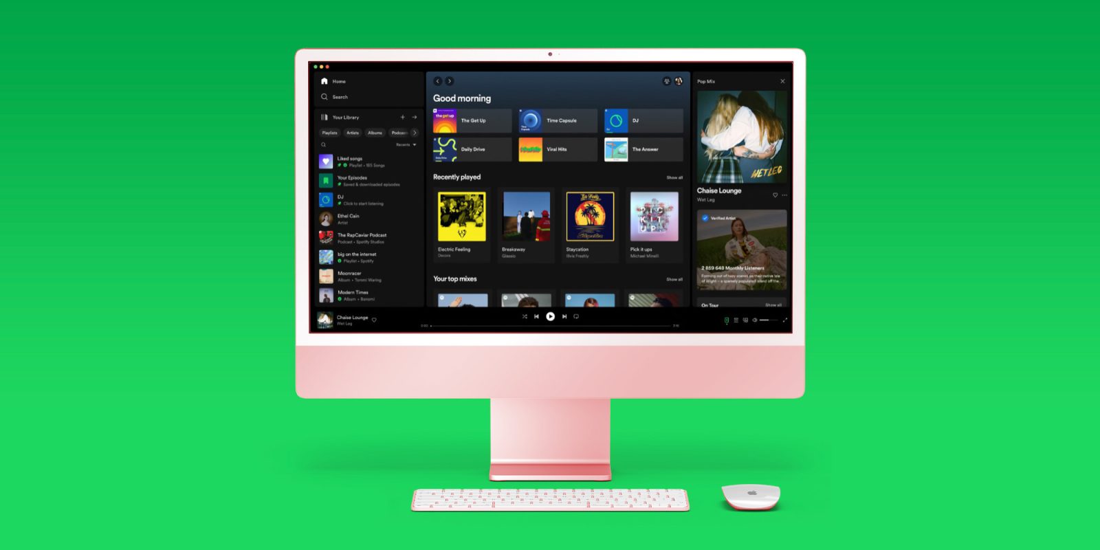
Spotify is out today with an overhaul for its desktop experience. The new UI brings redesigned ‘Your Library’ and ‘Now Playing’ sections to align more with the iOS/Android Spotify app and make it more seamless to “explore, curate, listen to, and organize Spotify on a computer or web browser.”
Spotify launched the new desktop UI today and shared all the details in a blog post and a short video. The company notes the center portion of the desktop UI remains the same as “your central hub to browse, discover, and find recommended songs and podcasts.”
But a new three-column design sees new Your Library and Now Playing experiences offer better and quicker access to music and podcasts, more information including tour dates, merch, and even transcripts.
Here’s how Spotify describes the new desktop sections:
On the left-hand side of the app window, we’re anchoring the new Your Library so you can quickly access your saved music and podcast collections. And from initial insights we’ve seen, users have found that the new Library helps them save time, provides them with a better overview, and allows them to more easily switch between playlists.
On the right-hand side of the app, you’ll find the Now Playing view, which displays the current song or podcast you’re listening to. You can even find more information about the song and artist here, as well as information on tour dates and merch—making it easier to connect with your favorite artists and discover more about them. For select podcasts, you can even follow transcripts as you listen.
If you’re looking for the Friend Activity feed with the new desktop design, that’s now found with the “three-person” icon beside your profile picture in the top-right middle of the screen.
Spotify also shared some tips on using the new desktop UI:
- Go compact: By default, you’ll see an expanded view of Your Library. But if you only want to see your playlist icons, you can simply click the “Your Library” button in the top right hand corner to collapse the library.
- Search & filter Your Library: Previously, the only way to find playlists was through the search bar—and you had to wade through not only your own content, but results from the entire Spotify catalog. Now, when it’s expanded, our new Library design allows you to toggle through your dedicated music, podcast, and audiobook feeds and search Your Library exclusively.
- Customize: We want this experience to fit the way you listen, which is why Your Library and Now Playing can both be resized to take up more or less of the screen.
- Pin, drag & drop: You can move and pin the playlists in the Library, as well as drop songs into the editable listed playlists.
Spotify says the new desktop UI is “rolling out to all Desktop users worldwide starting today.”
Check out a closer look at the new design in Spotify’s short video.
FTC: We use income earning auto affiliate links. More.


Comments